This redesign of the Soupstock festival marketing materials aims to bring this niche festival to a wider audience.
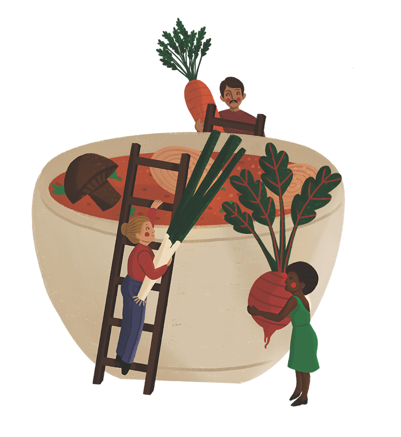

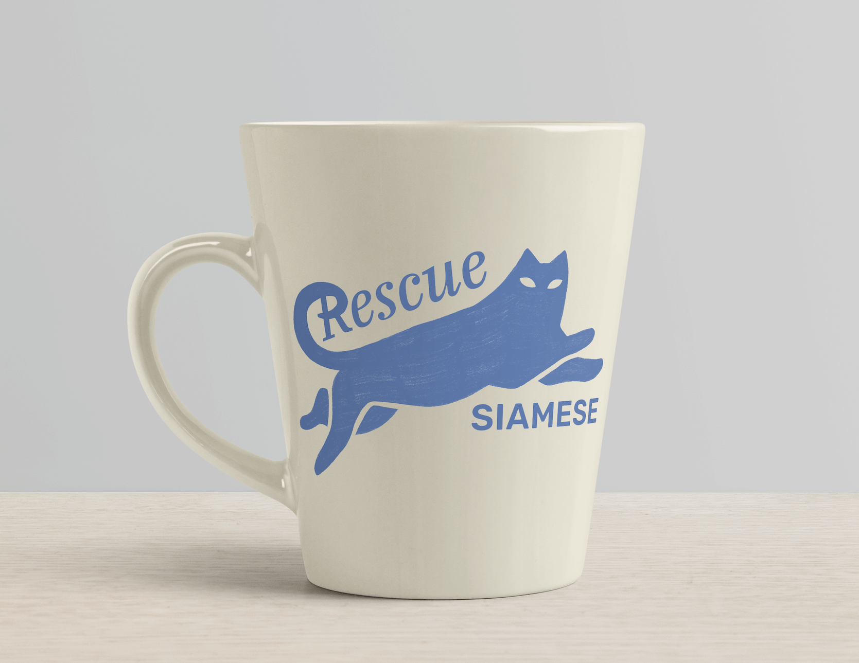
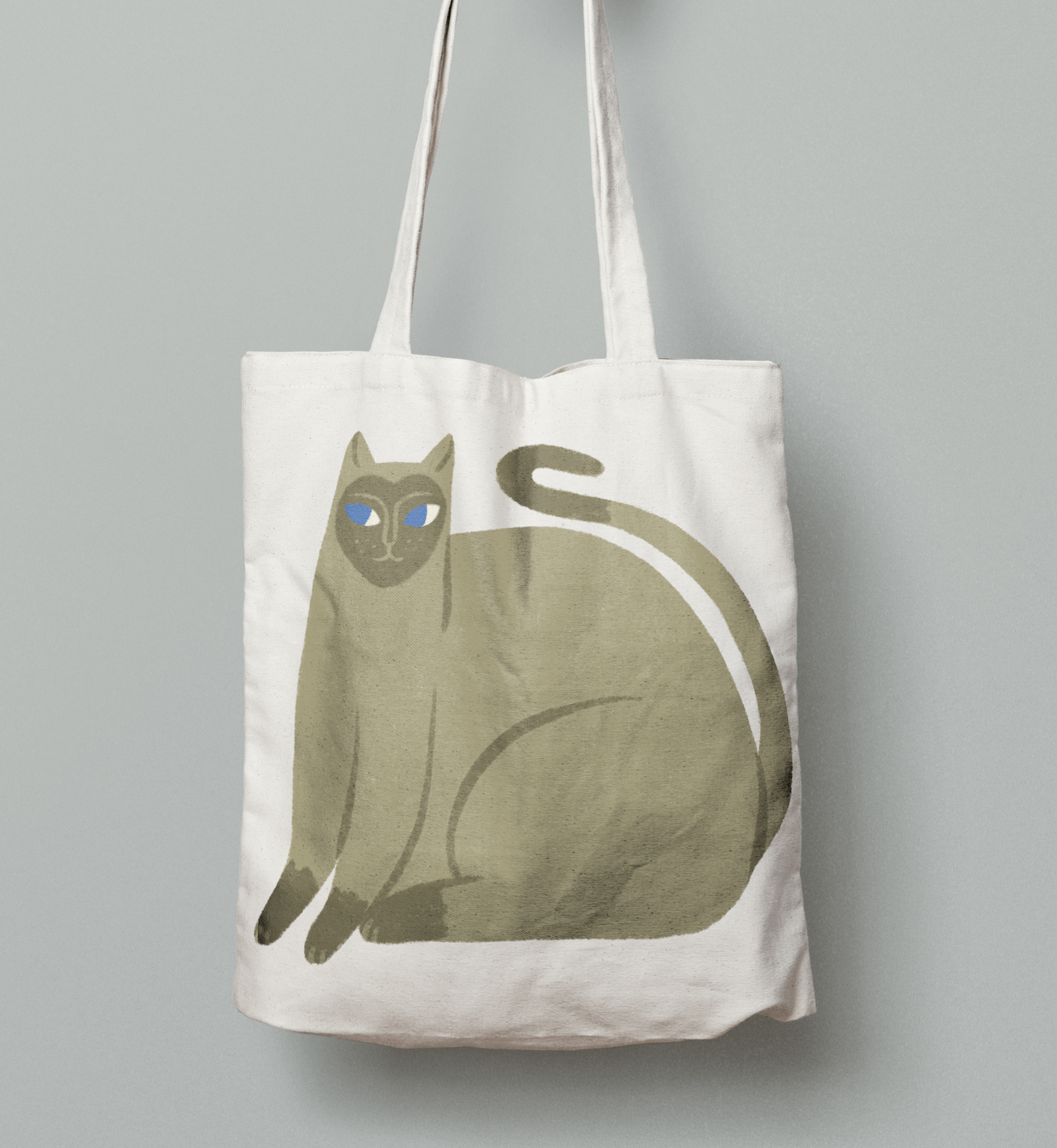
This festival has a wholesome, DIY and fun vibe. To reflect this, the graphics are hand rendered, with a natural and muted colour palette. The motifs are whimsical and simplistic to be recognizable from a distance.
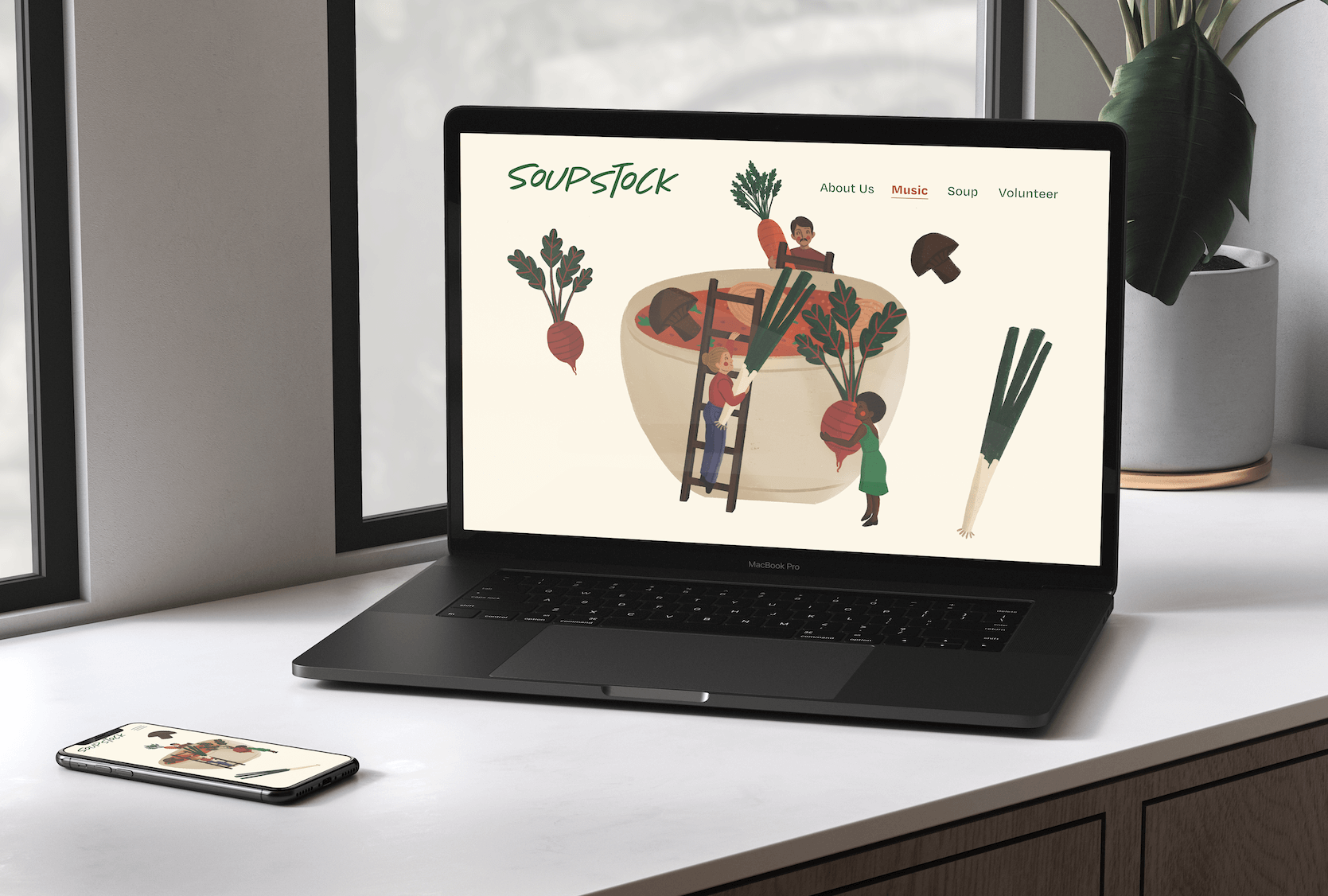
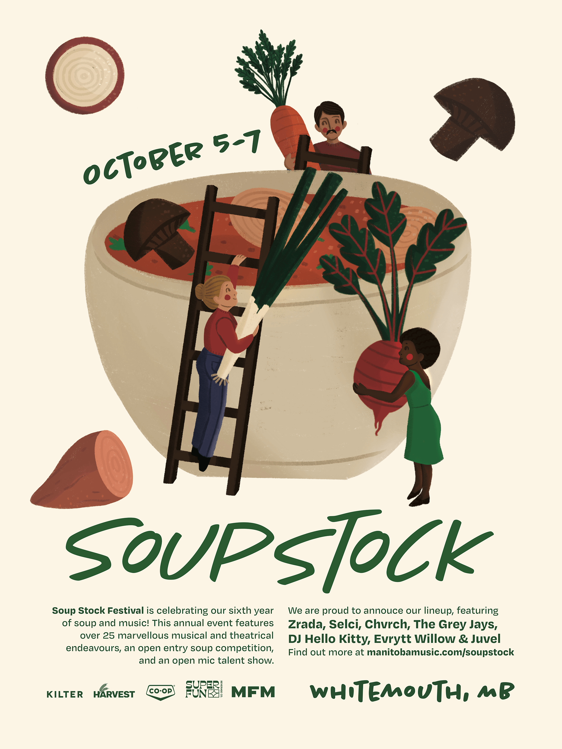 The new Soupstock rebrand extends to their website and socials.
 The website redesign allows viewers to learn more about their unique backstory, listen to the music of that year’s lineup, save and share soup recipes (with the previous year’s winners being featured) and apply to volunteer.
The same illustrative elements are used in their socials for brand unity and their content is more interactive. The winners of the soup contest are shared after the festival to encourage more people to enter next year.

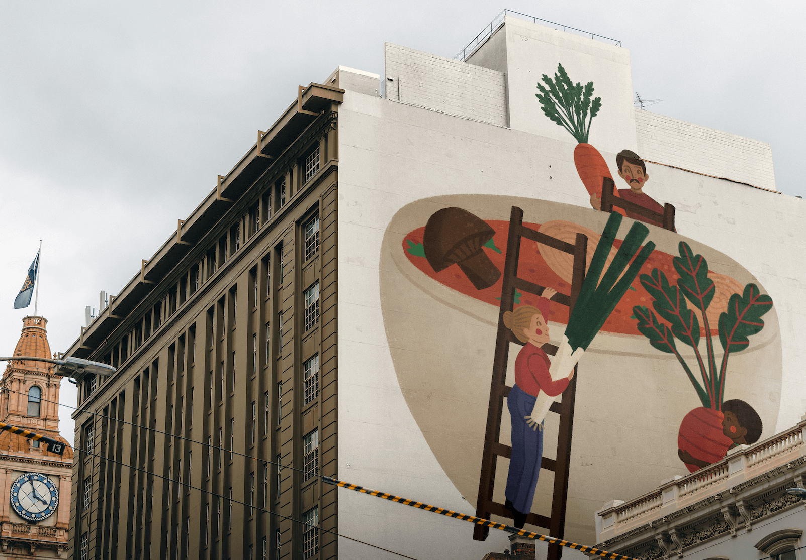
The posters would be placed around areas that the target audience would be in, such as the Exchange District, Osbourne Village and Corydon. They would also be placed at venues such as the Handsome Daughter and the Park Theatre. Another form of outdoor advertising would be a mural of the main Soupstock illustration.

